13ASED ON HUMAN

For Chessman, 2014 is a special one - on one hand she celebrates her 13th anniversary, on the other she sees the establishment of her Hong Kong branch. There is no reason why this gift set cannot be bigger - 8 kinds of stationery put inside a square box, wrapped in black - not a traditional choice of colour. Does not sound big? What if I tell you it actually is a manifestation of the phrase “Based On Human”, specially made for this holiday season? Chessman Post just chatted with Aramis, the Chief Designer of this project, to tell us stories behind this gift set.

It’s an experiment
“Making a stationery box set as present for celebrating Chessman’s 13th anniversary was a decision based on the limited production time; it may sound like a thoughtless decision. However, I would say it’s as a ‘design experiment’ because, first of all, if I could start from any angle and still make the theme, it’s a true manifestation of ‘Based On Human’ in a broader sense.
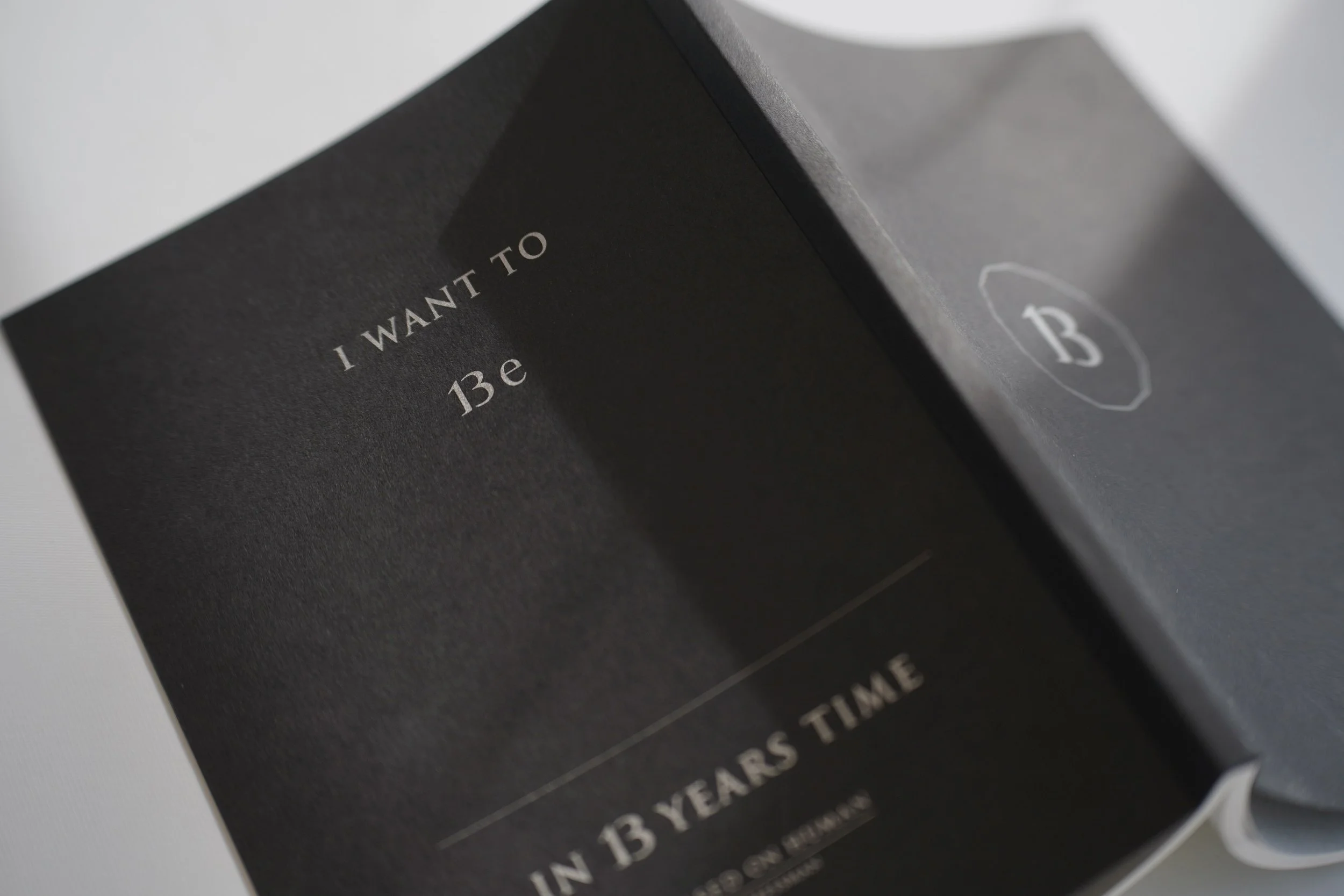
“Then my job was to find an entry point to the theme ‘Based On Human’. Considering it’s a Christmas present, I could not just print the logo on it; I’d to bestow something meaningful for it. So I explored the stationery and found that the note book was the biggest and most flexible carrier. Through the note book I tried to bestow some humanistic element for the whole gift set. I printed the phrase ‘I want to be __ in 13 years time’ on its back cover, wanted the receiver to fill in the blank. When every Chessman note book carries wish of its owner, this gift set would become something tailored for the receiver, making it a ‘human’ thing.
“I’ve always treated design as a visual expression, a magic to guide the observer how to see the object. So first impression is what I would stress on as the message behind it can’t run faster than the light being reflected to the eyes. To get people’s attention you have to start from the exterior, the message is best hidden from the scene and let them get to it slowly. So I was intentionally simplifying everything to the basic status when designing the set and its package - being basic is actually one of the core messages embedded in what we mean by ‘Based On Human’...and this is the second purpose of this design experiment: I wanted to know if people would think this black box as aesthetic or just too plain to comment. This experiment is still going on; I’d handed this gift set to a few clients personally to observe their reaction, and they all thought it was aesthetic. All-black package with nothing but a few words, such design did not bored them but made them be confident about our design.”

Less is More
“So this told us one thing: the more complicated your stuff is, like all these kinds of stationery, the more simple the package should be. Make them become one unified entity and the receiver shall follow steps you have arranged for them: starting from the simple package, you unwrap it from one layer to another, then discover its contents and messages, one layer after the other. Like books and texts, usually readers got attracted by its title first before they start reading, that’s why your article has to arouse people’s interest in 5 seconds, and your title has to be simple and concise. The more simple the design is, the harder the execution because you do not have extra gimmicks to make it look special; all you can do is to make the proportions right. MUJI, Apple, Ikea...they are beautiful because they have the right proportions. Arne Jacobsen the master of design once said, ‘the primary factor is proportions’.
“A stationery box set with reined packaging made this year’s Chessman gift set. It is a continuation of the 13th anniversary excitement, and I hope the receivers can think over how this gift set plays with the concept of ‘Based On Human’.”