Curry Kingdom
Brand Identity
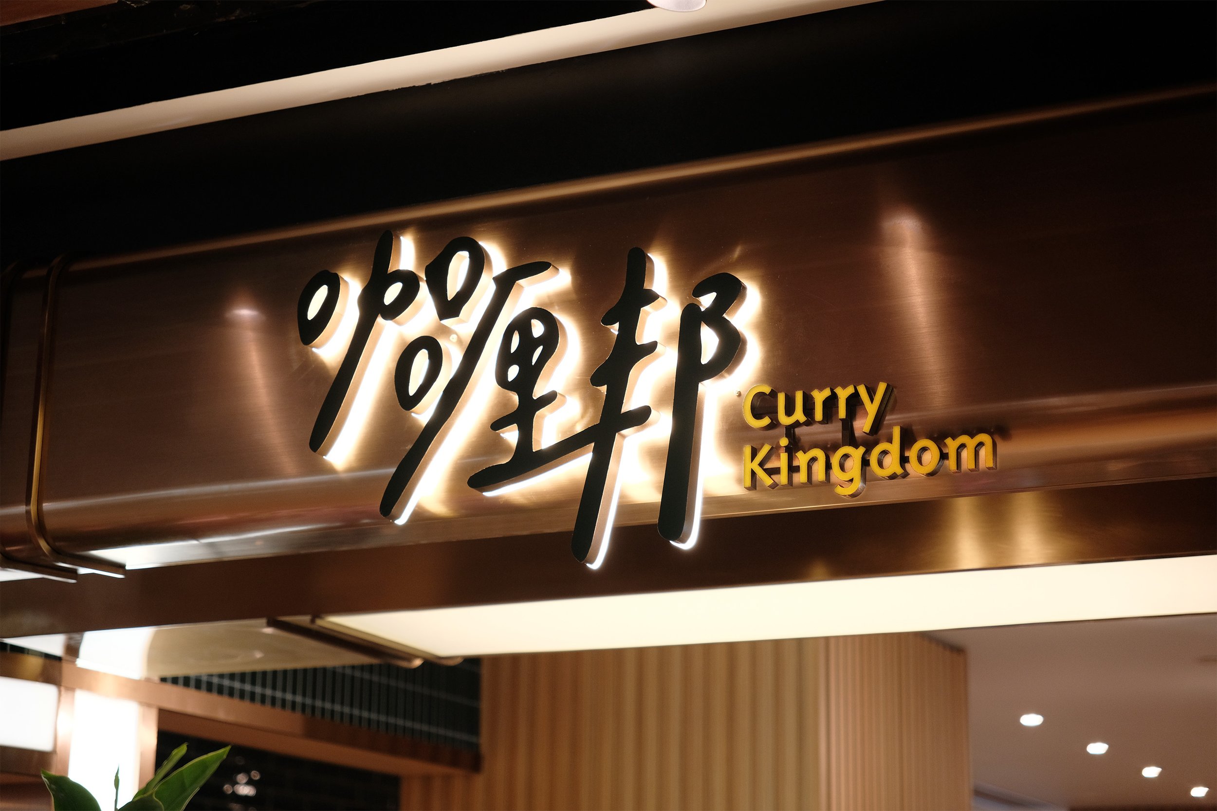
Curry Kingdom is a new casual dining restaurant that specializes in Asian curries and provides a new curry experience for young families. The brand identity design focuses on "friendly and playful" and emphasizes the hand-drawn feeling in the logo design, combining the three words "Curry Kingdom" into one.
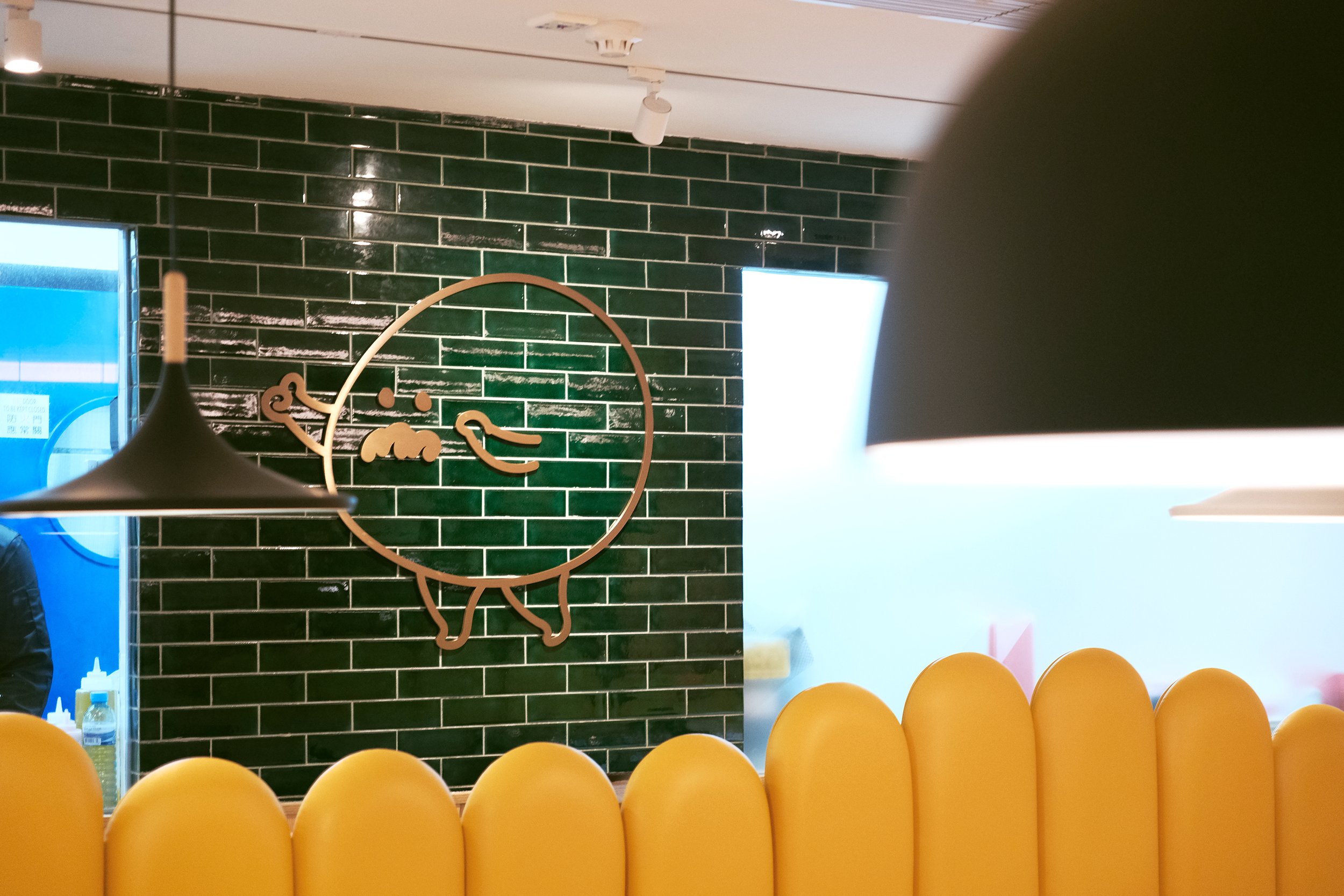
The design expresses the restaurant's intention to make delicious food with care. The mascot is designed as a personified Indian pancake to appeal to the target audience of families and young people, who are the main customers of the restaurant and to establish a friendly and approachable image.
咖喱邦是一間新派咖喱餐廳,專門提供多國特色咖喱,為年輕家庭帶來嶄新的咖喱體驗。為配合餐廳形象,品牌識別設計以「親切、俏皮」為重心,因此logo著重於手繪感,將「咖喱邦」三字合為一體,其隨形而有致的手藝感,恰以表達餐廳用心製作佳餚的初衷。
此外,由於親子和年輕一輩為餐廳的目標受眾,因此將吉祥物設計成擬人化的印度薄餅,化身為領隊穿梭於餐廳裝潢和印刷品內,建立餐廳的親和力。